Margit Hartnagel

Kunst am Bau

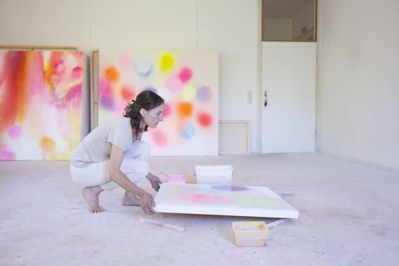
Margit Hartnagel's approach lies in the disclosure of space into the light, into the clear and into an atmosphere that enters into a warm dialogue with the interior of the room. She has already dealt with a wide variety of spatial situations in the form of a light wall accompaniment to the complete redesign to a place that is wrapped in soft lighting of color and form.

Here you can see examples of these previous redesigns.

Statement by Margit Hartnagel:

"In my contribution to APG, I developed two identical murals, each varying a horizontal pale red oval over two meters wide. The shape, size, and color of both ovals, painted directly on the wall in broad brush-applied stripes, are the same in each case, but both differ in the thickness and direction of their paint application. The ovals are contoured around an empty (white) area that has been "outlined", as it were, by the red paint. Thus, in Movement (in), the paint application runs more strongly from the outside to the inside, making the outer edge of the oval appear sharply outlined, while in Movement (out) it is just the opposite. With these two corresponding, yet opposing forms, I intended to illustrate the gradual transitions that occur when different systems or states approach each other. Inside runs to outside and vice versa. The work is understood as a painterly-concrete statement of spatial-relational components. These two harmonic ovals design themselves like yin and yang of Chinese philosophy as opposing principles and refer to no context, seeming at first glance almost hermetic and strict in their minimalist brittleness. However, an atmospheric mood is created by the painterly, lively application of paint and the manual, un-taped gradual approach of the border zones."

A project in "Artoffice under Construction: An Art Project by Austrian Power Grid.

Statement by Margit Hartnagel:

"The NEW, LIGHT FLOOR COVER sets itself off from the previous dark one already in front of the entrance and marks accompanying the entrance into the farewell room. Through the WHITE, SEMITRANSPARENT FRONT, the intimacy and tranquility is already perceptible from the outside, the figure of St. Barbara is glimpsed. Entering this room, silence and light immediately surround us. Lightly glazed wooden stools made of maple invite you to take a seat. But they also promote alertness by not being able to lean on them, to hold themselves upright. Give through their sensual materiality, waxed wood and through their clarity of form and craftsmanship (solid wood, dovetail joint....) security and anchoring without being distracting. Maple is the tree of reflection. Lets people who are stressed or have experienced a shock find their peace again. The TEXT ON THE WALL wants to be a spiritual support in terms of content, but also through its design. The letters are scratched into the wall. The text thus remains subtly in the background and yet is present. In terms of content, it allows one to find comfort, confidence and also strength. In the center of the room the coffin is laid out. The colorful flower wreaths are the only color accents in the light-white-lit room. The bright, light and contemplative atmosphere is also promoted above all by the bright white LEHMPUTZ (good room climate: open-pored, breathing) and the glazing painting technique. The addition of finely ground rock crystal on the one hand creates a fine glitter and delicate glow, but also its energetic meaning, in the promotion of high light energies and the defense of deep, dark, contributes positively to the state of mind of the place. The coffin stands directly in front of the circular central LICHTWERK "threshold". Fine gradations, through superimpositions of paper circles, lead the material density of the wall into lighter and lighter areas, to finally slide completely into a light, bright space that radiates and shines as if from itself. The light created by the layers supporting and transilluminating LED light panel radiates out into the entire space, enveloping it in a diffuse, warm atmosphere created primarily by the materiality of the paper, which has been coated with beeswax and thus made transparent. It seems as if the deceased goes into this light or this light draws him to himself. The living take part in it. When they return to their daily lives, they will take this image with them internally. The light also discreetly brings out the letters of the text. It gives the statue of Barbara a respectful yet reserved presence. It stands protected in a niche. The niche IS PAINTED WITH GLITTERED GOLD, suggesting on the one hand the dignity and sanctity of the figure, but also the joy and lightness she embodies through her unwavering faith. The gold corresponds with the golden niches in the aisle, but also deliberately contrasts with the heaviness and density of these, as the white spaces between the gold particles create a dancing, light impression. The appearance of the patron saint as the dark one, the one who conceals, but also as the one who warms, who stands for abundance, prosperity and joy of life, is supported by this design. As a counterpart to the "earth room" (a farewell room already designed by another team of artists), the "light room" allows a different perspective on death. On the one hand, the overall design of the farewell room as a "spiritual anchor point" fits in well with the previous redesign of the farewell hall, but also expands it in a meaningful way. The farewell room can become a spiritual anchor point, even without being directly affected by the proximity of death. The experience of the threshold, of the transition, can be a help for all people in special times, and thus expands or sets the cemetery site in a context of artistic - spiritual engagement even beyond death and dying."

Realized in 2016